
So you’ve written all the content for your book and maybe you’ve got some photographs or drawings as well. You are right to be concerned about the elements of making your manuscript actually look like a book. There is, as you suspect, the potential to make a world of difference to the appearance of your book by putting some professional thought into the many subtle, but important elements of page design and typography.
What kind of things are we talking about? What are the elements that go into making a book a pleasure to read, to help your reader flow through your book without noticing how easily they are absorbing the information you are wanting to impart on them?
Page size and orientation:
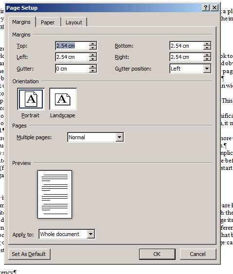
Page Setup dialogue box in Microsoft Word
Take a look carefully at other books that are for sale in the market that you wanting your book to enter. It is important to match your readers expectations with the book they are looking at. It may sound obvious, but larger is not necessarily better. A guide book might have to fit in someone’s pocket. A smaller size page will create a thicker book, which may give a higher perceived value than a thinner, but larger sized book.
A book of portrait pictures would be great using a portrait format book (ie height greater than width), but if there is text to accompany the photos, a landscape format might work much better.
It is important that a cookery book should be able to stay open at a page without being held. This is more likely to be possible if the book is wider than it is high, particularly with some types of binding.
If the book is likely to sold from a bookshelf, it may not get positioned correctly if it is a significantly different size or orientation to its competition. Conversely, if it is too similar in size to its competition, it might not get noticed.
A square format book, enables other layout formats to be used, that are more difficult with more traditional sizes, such as multiple columns and larger margins which can be utilized for special features.
Always speak to your printer before you decide on the page size because of the many cost implications associated with producing different book sizes. You need to be sure about the exact page size before any page layout (formatting) is commenced, as changing the page size after formatting means having start formatting all over again.
Photo / image appearance
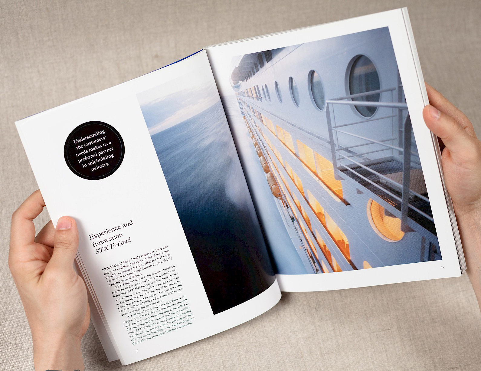
 Some images are more important than others, some are of a better quality than others. Some are high quality, but are limited by their resolution. Do you sit an image in lots of white space, does it line up with the text above and below, does it go right to the edge of the page or does the text wrap around it? Does the image itself require traditionally square edges within a black thin boarder (key line) or should the image be a different shape or have softer borders. Once you have worked out a basic page design, there will always be images that break the rules of your carefully thought out formatting rules. Careful consideration and technical knowledge can help to decide how best to display every image to its best advantage.
Consistency
The reader of your book is an expert in picking up on the subconscious rules that you embed in the design of your pages of your book. They will quickly pick up on any inconsistencies in headings, style or features and this will inevitably have an adverse effect on their reading experience. Once you create a style it is important to stick to it wherever possible.
Font choice
There are now literally hundreds of different fonts available. Fonts are split into 2 categories:
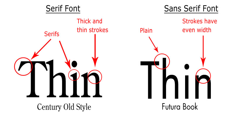 Serif: Serif’s are small, sometimes curly lines used on the ends of characters. Examples of serif fonts are Times New Roman, Garamond, Rockwell, Courier and Bodoni. They are commonly used for body text because many people think they are easier to read.
Sans Serif: (Without Serif) are typefaces without little lines attached to characters. Examples of sans serif fonts are Helvetica, Futura, Arial and Avant Garde. Sans Serif fonts are commonly used for headings and titles because they are good ‘attention grabbers’. More contemporary style books also use sans serif fonts for the body text.
The finer details of choosing a font are very much down to personal preferences and can help to give a book its own unique feel.
Margins
Often overlooked, margins, coupled with line lengths are very important for the readability of your book. It is important to create the right balance between text and white space that matches the content and thus helps to formulate the desired mood of your book.
Text falling too close to the page edge will feel uncomfortable to read and text too far away from the edge of the page will feel lost and equally uncomfortable for the reader. It is useful to experiment with a full sized mock up before committing to starting your page formatting. Many people consider that line length should be between 50-70 characters (or about 9-13words) for optimum readability.

The type of binding will affect your inside margins
When calculating margins for page designing, I always take into account the type of binding of the book. This is because some types of binding allow the pages to open up better than other types of binding. On such occasions, it may be prudent to create a larger inside margin than outside margin so that the text appears to be balanced on the page. This is particularly important on the first and last page of a book, where a glued hinge cause page area to be lost.
Other choices to consider:
Page numbering
Front matter (Prelims)
Back matter (Poslims)
Interesting features. E.g. photo frames, shadows, note paper, post it notes, backgrounds
Do it yourself?
If you’re confident that you know exactly what you want your page to look like and you have access to Word processing software like Microsoft Word, Open Office or Apple Pages, then why not design your book yourself. Most of these packages have the capability to handle all the above features well when producing a book with only text. However once you have pictures / images in your book, you will get much better control over the final quality of your images using professional software such as Adobe InDesign or Quark Express. Other advantages of using professional software when producing a book with images are: smaller document file sizes, better typographical options, more special features, such as shadows / feathering, advanced page numbering, prevention of text reflow from page to page, total control over printing related features such as overprinting, CMYK colouring, bleed, colour management and most importantly creating Print Ready PDF files.
Please feel free to contact me if you would like to discuss any of the above or suggest improvements to my blog.
David Exley david@beamreachuk.co.uk
Written by David Exley
David has an Honours Degree in Printing and Packaging Technology and has worked in design, technical and sales roles in both the Paper and Printing industries for over 20 years.